
Creator workflow · Datacolor · Vertical video
Why Color Accuracy Matters in My Editing Workflow
I have used Datacolor SpyderPro for years. Here is why matching my monitors and checking color are part of the work around my photographs and videos.

Vertical video · Watch on Instagram
Along the Way
In this story.
I have used Datacolor SpyderPro for years. Here is why matching my monitors and checking color are part of the work around my photographs and videos.
Sponsored by Datacolor.
If the colors on my screen are not accurate, it is harder to trust the decisions I am making in an edit. I have used SpyderPro by Datacolor for years, and matching my stacked monitors is one of the reasons it stays part of my workflow.
It is not only about a single screen. When I shared this video, I also talked about soft-proofing and looking at how work will be seen across devices and print. Those are useful things to keep in mind when the finished image is going somewhere beyond the editing desk.
The work around the image
There is more to finishing a photograph than moving sliders until it looks good on one display. For me, checking color is part of giving those choices a more consistent starting point.
If you already own a Spyder, check the software and hardware compatibility for your specific model. Datacolor's available features and upgrade paths vary, so do not assume the tools in my video apply to every sensor. Official Spyder upgrade and compatibility information.
A few finished examples
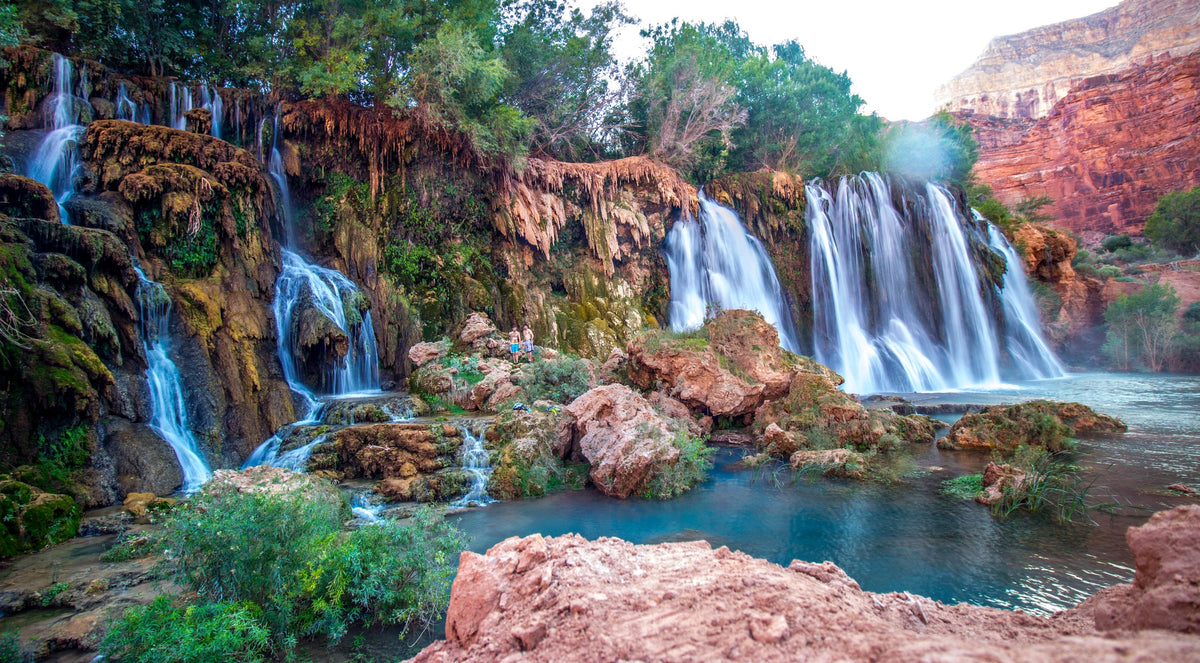
These photographs show the kind of finished work I review on a calibrated display. The scenes are very different—from layered canyon color and water to mixed cave lighting and a softer coastal sunset—but each one depends on being able to trust the color and contrast decisions I am making.


What is one part of your editing setup you wish you had paid attention to sooner?
More Along the Way
Keep exploring.
All stories ↗
South Falls at Silver Falls State Park: An Oregon Waterfall Day Trip
A South Falls-focused day visit to Silver Falls State Park during our Allegiant-supported Oregon trip, with walk-behind waterfall views and practical planning notes.
Read the story
Weavers Needle from Fremont Saddle: Hiking & Photo Tips
A photo-led look at Weavers Needle from Fremont Saddle, with a Peralta Trail hiking option, preparation advice, and practical desert photography tips.
Read the story
Some of My Favorite Dana Point Photo Locations
Coastal viewpoints, harbor walks and sunset light at some of my favorite Dana Point photo locations, with notes on our hotel and food stops.
Read the story